

Responsive Web Design: Your Guide to a Better User Experience

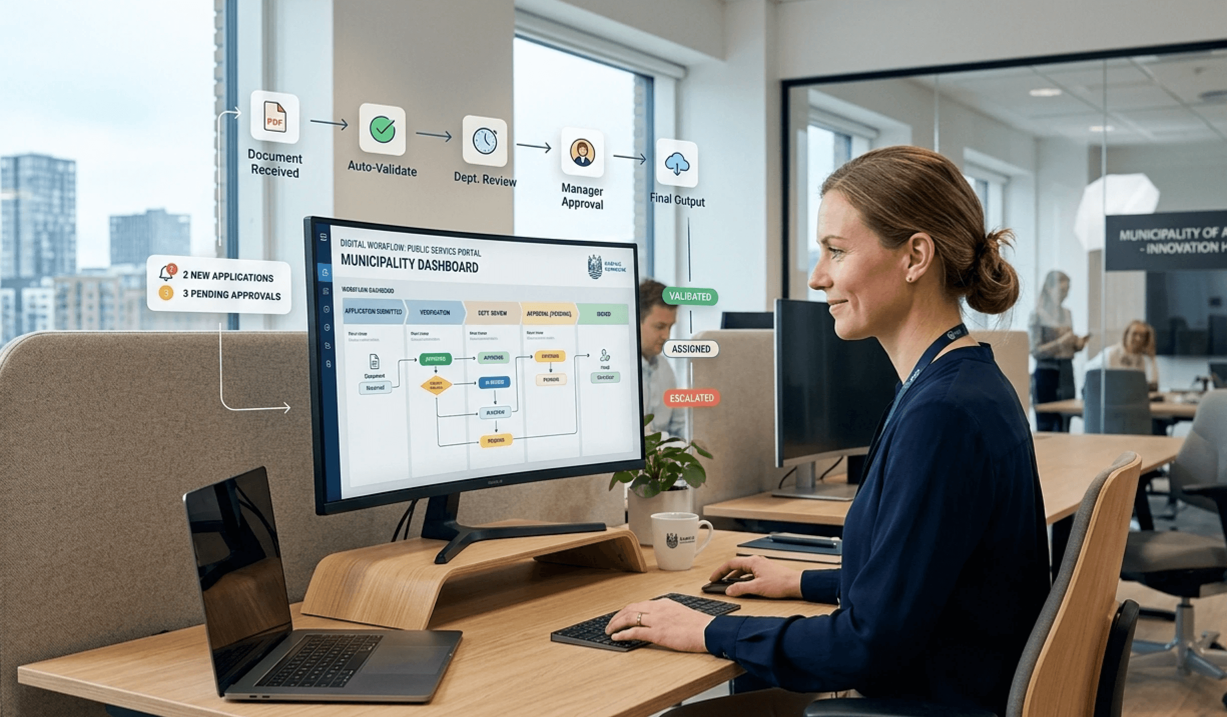
A leader knows the situation. The organisation has invested in a new website, an intranet or an employee portal, but everyday life quickly reveals the issue. What looks tidy on a large screen becomes slow, cluttered and cumbersome on mobile – exactly where many employees are actually trying to use it.
It is not just a design problem. It is an operational problem, a communication problem and often also an adoption problem. When a driver, a nurse, a production worker or a leader on the move cannot quickly find the right information, usage drops. And when usage drops, the platform loses its value.
What is responsive web design and why is it crucial in 2026
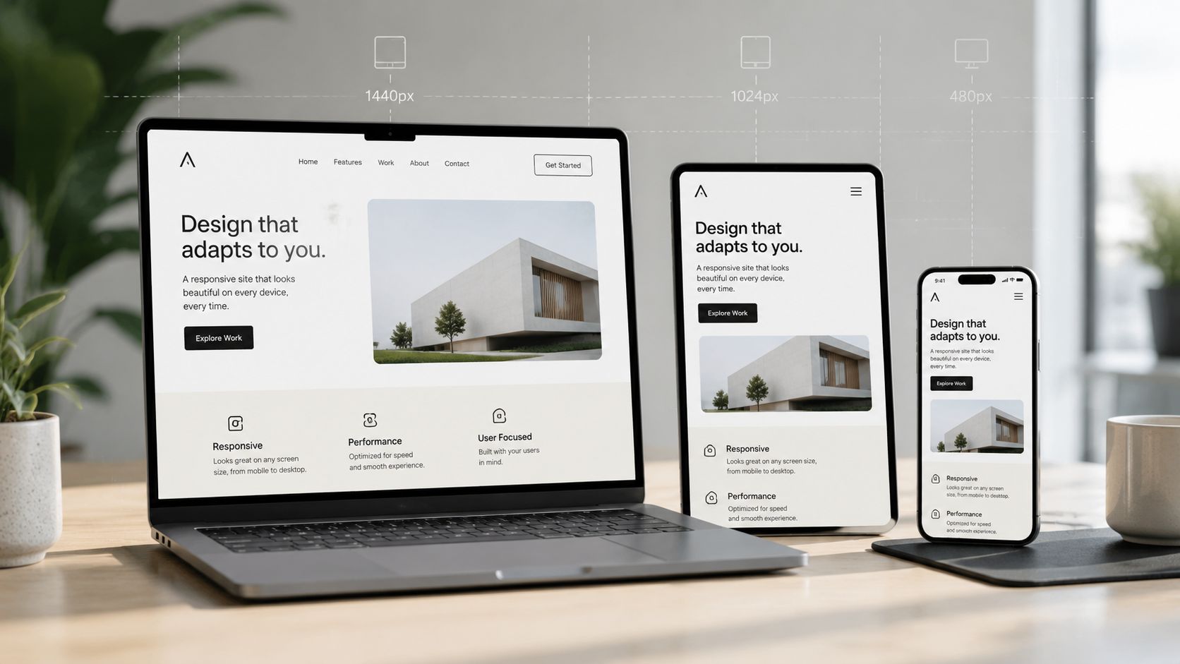
Responsive web design means that the same solution adapts to the screen the user is holding. Content, navigation, images and actions do not change function, but they change shape, size and priority so that the experience makes sense on mobile, tablet, laptop and larger screens.
It sounds technical, but the business point is simple. The user must be able to solve their task without zooming, searching or giving up. This applies to both the external customer and the employee who is in the middle of a work situation and just needs to find a procedure, a contact person or an important message.
According to Hostinger's overview of web design statistics, 94% of users judge a website based on how responsive the design is, making it a critical factor for first impressions and user engagement. This explains why responsive web design is no longer just an extra detail. It is the basic form of any solution that needs to be used in practice.
The old approach works less effectively today
Many organisations are still stuck in a desktop logic. They design for the office workspace first and then try to squeeze the experience down onto a smaller screen. The result is often that the mobile user gets far too much content, targets that are too small to click, and too many steps to reach the most important actions.
This is also why separate mobile sites are rarely the right path today. They create more maintenance, more complexity and often an inconsistent experience. A responsive setup instead consolidates the experience into a single solution, where the structure is recognisable but the prioritisations are tailored to the device.
Responsive web design is not about showing the same thing on all screens. It is about making the same content usable in different situations.
Why it has become a management responsibility
When an organisation discusses a digital workplace, service experience or internal communication, responsive web design should be introduced early in the conversation. Otherwise, you risk investing in content and functions that a large portion of users will never derive real value from.
This applies especially to organisations with many deskless workers. Here, the mobile experience is not a secondary view. It is often the primary access to information. Therefore, responsive web design is closely linked to questions of adoption, engagement and efficient operations, just as many also see is the case when working with the requirements for the intranet of the future.
The technical principles behind responsive web design
The technical side does not need to be complicated to be understandable. For a non-technical leader, it is enough to know the mechanisms that determine whether the solution becomes smooth or frustrating.
One solution across screens
A good analogy is to think of the layout as a room with flexible walls. Instead of building three different rooms for desktop, tablet and mobile, you build one room where the elements can move and resize without losing functionality.
This makes sense for two reasons. The user gets a more coherent experience, and the organisation avoids running multiple parallel versions of the same content. When a piece of news, a document or an important function needs to be updated, it happens in one and the same place.
Three building blocks that make it work
Most responsive solutions rely on three basic principles:
Fluid grids mean that the layout uses relative measurements rather than fixed widths. The content can therefore utilise the space on the screen without breaking down.
Flexible images and media ensure that images do not break the layout on small screens, but scale down instead.
Media queries are rules that tell the design when to change structure or priority, for example when the menu needs to be compressed, or when content needs to be stacked into a single column.
The last point is important in practice. Many believe that responsive web design is merely about making things smaller. It is not. It is about changing the composition so that it fits the task on the specific device.
Where performance becomes part of the design
This is where many projects fail. They have a layout that technically can adapt, but they forget about images, icons and loading times. Then the solution feels heavy, especially on mobile networks or in environments with unstable connections.
Interaction Design Foundation's review of responsive design principles highlights benchmark data from Danish web development projects, where the implementation of SVG files for icons and dynamic scaling of images with max-width: 100% reduces network load on mobile by up to 30% and increases page speed on mobile by 15–20%. This is particularly relevant in municipalities and healthcare organisations where many users open the solution from their mobile phone during the working day.
Practical rule: If images, document cards and buttons are not planned for small screens from the start, the mobile version will be slow and imprecise, even if the desktop version looks great.
Another important technical discipline is working with multiple breakpoints. In practice, this means that the solution should not just work on a large and a small screen, but also in the gaps where many problems tend to arise. Tablets, small laptops and large mobiles quickly reveal if the design is indeed robust.
Benefits that extend beyond screen size
When leaders ask why responsive web design is worth prioritising, the answer is rarely "because it looks better". The correct answer is that it makes digital solutions more applicable to the organisation's operations.
When accessibility becomes engagement
A responsive intranet or website meets the user where the work takes place. In the office, this means overview, concentration and access to multiple tools simultaneously. On mobile, it means quick action, fewer choices and clear priorities.
This is precisely why NN/g's analysis of responsive intranets is interesting. Following the implementation of responsive design in an intranet, employees can access all intranet content on any mobile device or computer. It is supported by a single code base, but with differentiated user experiences, resulting in desktop usage remaining stable while mobile usage rises significantly for operational employees.
This is an important leadership perspective. If a platform only works well for desk-bound employees, it quickly becomes perceived as "the office's system". If, on the other hand, it also works in everyday operations, it becomes a shared working platform.
One digital foundation is easier to run
For operations, governance and communication, there is also a more down-to-earth benefit. A single consolidated solution is easier to maintain than multiple special versions. Editorial teams can focus on the quality and relevance of content instead of managing parallel structures and custom logics.
This also provides better conditions for internal communication across employee groups. When frontline employees can actually read and act on information in their work situations, mobile access becomes part of the communication strategy and not just a technical requirement. This perspective is central in the work with mobile internal communication for frontline employees.
Better adoption: Users return when they can quickly find the most important things.
More consistent communication: The same message can reach the office, operations and teams on the move alike.
Lower complexity: Editors and IT work in one single solution instead of several.
Stronger decision-making basis: Behavioural data becomes easier to interpret when the experience is not split across multiple sites.
Responsive web design is therefore not just a design choice. It is a way to reduce friction between information and action.
UX and accessibility in a responsive design
A solution can easily be responsive without being good. It can adapt to the size of the screen but still be difficult to read, hard to tap on and complicated to understand. Therefore, UX and accessibility must be evaluated as part of the same task.
What works for people on small screens
On mobile, space is limited, but the user's needs are often very concrete. Therefore, these design principles typically work best:
The most important first: The home page should prioritise news, shortcuts, documents, local messages, HR information and operational updates rather than attempting to display everything.
Fewer clicks to key tasks: A procedure, a contact person or shift information should be easy to reach without detours.
The same logic across devices: The user must be able to recognise the structure, even when the content is presented differently.
Clear words instead of internal system names: Navigation with terms like "Operations", "HR", "Safety" and "Documents" works better than internal industry jargon.
Visual calm: Clear sections, short texts and fixed placement of key elements reduce cognitive load.
These choices are particularly important for non-technical users. If navigation requires training, the design is usually too complex.
Legal requirements and usability go hand-in-hand
Accessibility is often treated as a compliance exercise, but in practice, it is a usability task. When buttons are too small, contrast is too low or text is cramped, the solution loses both its reach and impact.
The Danish Agency for Digitisation's technical guidance for EN 301 549 makes the requirement clear. All websites and mobile applications that must comply with Danish web accessibility legislation must meet the European standard EN 301 549. This requires that interactive elements such as buttons scale to at least 44 × 44 CSS pixels to ensure accessibility for users with motor coordination challenges.
This requirement has a direct consequence for design decisions. If mobile menus, filter buttons or shortcuts become too close together or too small, misclicks and frustration rise. This particularly affects users who are working fast, are on the move or have motor coordination challenges.
A responsive design is only successful when the user can read, understand and act without assistance.
Another important point is navigation. What works on a desktop with wide menus and many choices rarely works on mobile. Here, navigation should be more focused, more action-oriented and less dependent on the user already knowing the structure of the system.
Responsive design in practice – from website to intranet
The clearest proof of the value of responsive web design is rarely found in mockups. It is found in daily use. Especially in organisations with desk-bound staff, operational personnel and employees on the move, the difference quickly becomes apparent.
A redesign that changed daily use
A typical example is an intranet where the home page was originally built based on a desktop logic. Office-based employees could navigate fine, but employees on mobile found that the most important links were too far down, documents required too many clicks, and operational updates drowned in general news.
The redesign took its starting point in different user groups. For desktops, the focus was placed on getting an overview, news, access to tools and cross-cutting information. On mobile, the focus was placed on quick access to operational messages, procedures, contacts, shift information and local updates.
In particular, the following were measured:
Active users by device: Whether more employees began using mobile, while desktop behaviour remained stable among office staff.
Clicks on quick shortcuts: Whether shortcuts to procedures, documents, HR information and operational tools were actually used.
Time spent finding key documents: Whether users found important procedures and guides faster.
Readership rates on targeted messages: Whether operational messages and local updates achieved greater visibility on mobile.
Search behaviour: Whether repeated searches for the same documents decreased when content was made more visible.
Feedback from employees: Whether both office-based employees and staff on the move found the solution easier to use.
Following the redesign, the organisation typically saw a clear improvement in mobile usage, more clicks on relevant shortcuts and better engagement with targeted messages. The key lesson was simple: desktop must provide an overview; mobile must provide quick access and action.
Why healthcare and manufacturing notice the difference first
In healthcare and care intranets, the need is particularly clear. Employees move between tasks, locations and shifts, and they rarely have time for lengthy information consumption. Shortpoint's review of intranet examples points out that 80% of intranet visits are driven by high-traffic pages like the home page and document centres, and that time spent finding documents should be under 60 seconds to retain the user.
This aligns well with reality in complex organisations. If a nurse needs a procedure between tasks, or a production worker needs to check an updated safety instruction, there is no time for long click paths and heavy navigation. If access requires a stationary PC elsewhere in the building, the solution is in practice rejected.
When information is only easily accessible at a desk, it does not become part of the workflow for employees in operations.
This is also why mobile access should not be reduced to "a smaller layout". In practice, the organisation needs to think in terms of quick updates, short action paths and direct access to what is used again and again. This is the same logic that lies behind a dedicated mobile app for intranet use on the go, where timing and access matter just as much as the content itself.
Design Focus: Desktop vs. Mobile
Aspect | Desktop (Overview and deep dive) | Mobile (Quick access and action) |
|---|---|---|
Amount of Information | More room for news, cross-cutting information and multiple entry points | Fewer elements, clear prioritisation of the most important things |
Navigation | Broader menus and more simultaneous choices | Simpler structure with short path to core tasks |
Document Access | Suitable for reading, comparing and longer work tasks | Suitable for quickly opening procedures, contact details and messages |
User Intent | Overview, planning and focus | Action, orientation and task-solving in the moment |
Content Placement | Room for both primary and secondary content | Primary content must be at the top and immediately visible |
How to test and optimise the responsive experience
A responsive solution is not finished when it is launched. It is only good when it works in the concrete work situation. Testing should therefore be a combination of technical measurements and realistic tasks performed by the people who actually have to use the solution.
Test the technical setup first
Start with the basics. The home page, news, documents and search must load quickly enough on mobile, even when the user is not connected to a stable office network. This is particularly true in highly secure or locally hosted environments where architecture can affect speed and rendering.
This is a real challenge in Denmark. In the public sector, there is an under-examined tension between data sovereignty requirements and a mobile-first approach. 78% of municipalities require local hosting, while 54% of users primarily use the intranet via mobile. Yet, few guides address how to optimise mobile load times and touch targets in these often on-premises environments.
A practical test suite should therefore include:
Real devices: Test on physical smartphones and tablets, not just in the browser's preview mode.
Core flows: Opening a notification, finding a procedure, reading an operational message, searching for a contact person and opening a document.
Touch and readability: Check if buttons, links, headings and content are easy to use without requiring high precision typing.
Network scenarios: Evaluate the experience outside the office, where the connection may vary.
Then test the work situation
Once the technical side works, everyday work life needs to be tested. Here, users often reveal issues that no style guide catches. A driver might search for something else than what the editorial team thought. A nurse might not read the entire message, but scan for one specific instruction.
The best user tests are task-based. For example, ask an employee to find the latest safety procedure, open HR information or find the contact person for their own department. If it takes too long, or if the user takes the wrong path, it is the design that needs adjusting.
Practical assessment: If an employee can quickly open a message, find the correct information and act without help, then the mobile experience is working.
After launch, the organisation should monitor behaviour continuously. Mobile usage, readership rates, clicks on shortcuts, searches, document views and employee feedback provide a better picture than technical dashboards alone. If many people continue to search for the same document, it is rarely because search is the issue. It is often because the navigation or visibility does not match the user's logic.
Conclusion: Responsive design is a strategic necessity
Responsive web design is no longer a matter of making a solution look decent on a telephone. It is about whether the organisation's most important information can actually be used where the work takes place.
The key difference is not technology alone, but prioritisation. Desktop should support overview and focus. Mobile should support action, timing and access to the most important things. When organisations understand this difference, the relevance of websites, intranets and internal tools alike rises.
For leaders, the consequence is clear. If the digital experience does not work across devices, the organisation loses engagement, speed and consistency. If, on the other hand, it is designed responsively and tested in real work situations, the digital platform becomes an active part of daily operations. This is why responsive web design should be treated as a strategic investment in employee experience, operational efficiency and a more inclusive digital workplace.
Colibo helps complex organisations create a digital workplace that works in practice on both desktop and mobile. If the goal is an intranet with an exceptional user experience, Danish or EU-based hosting, high data sovereignty and access for employees on the go, it is worth taking a closer look at Colibo.